Grout Color Is Half the Design: A Practical Guide
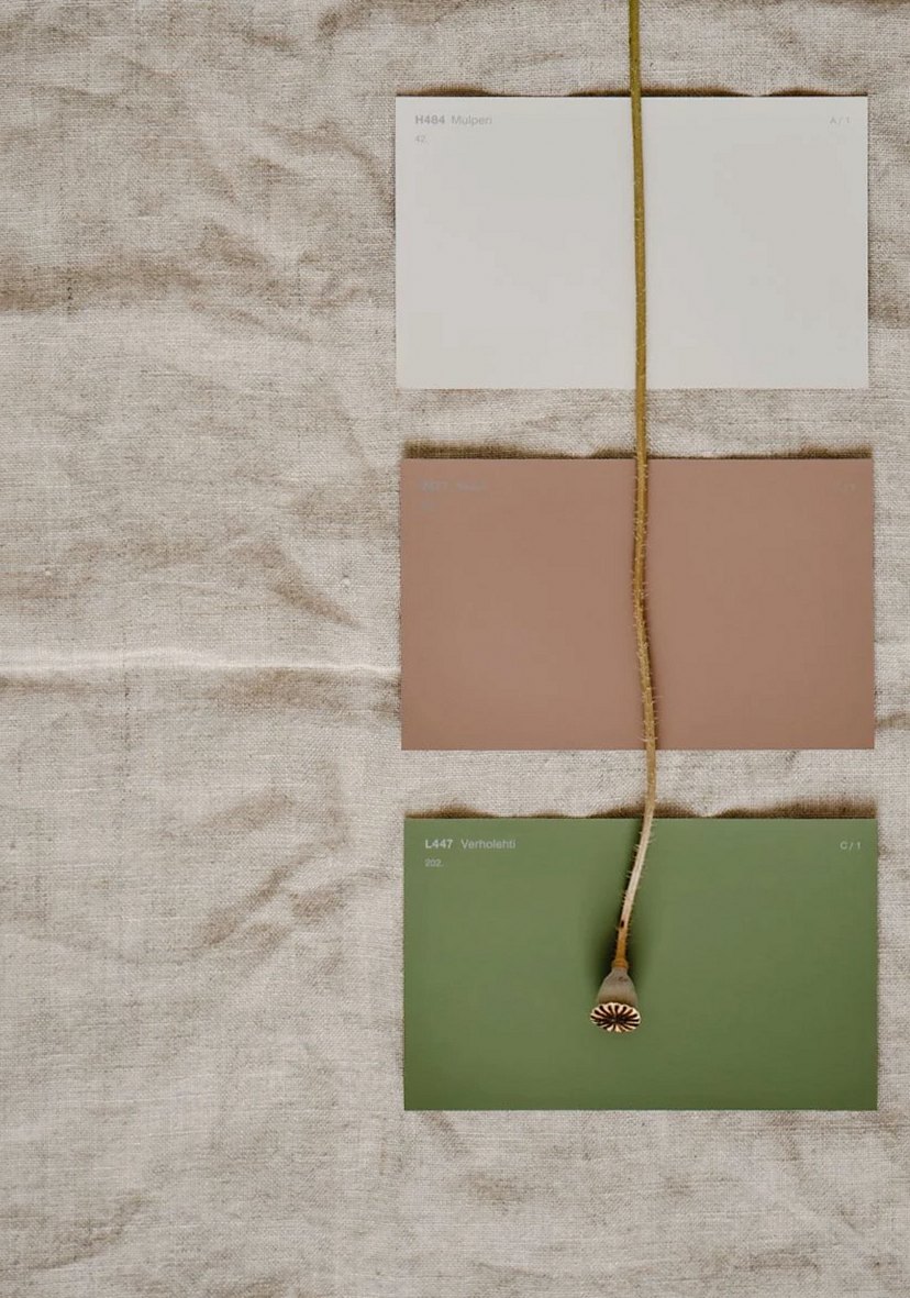
Grout covers 15 to 20 percent of most mosaic surfaces. On a dense geometric pattern it can be higher. Choosing the wrong color does not ruin the tile, but it can flatten a design that should have had depth, or create a visual noise that was not in the plan. This guide covers how to approach the decision properly.
Why catalog numbers are a starting point, not an answer
Pre-pigmented grout comes in several colors, and the catalog photographs are reasonably accurate under neutral daylight. The problem is that most rooms are not lit by neutral daylight. Warm LED fixtures, north-facing windows, and colored walls all shift how a grout color reads in practice.
The only reliable way to choose a grout color is to mix a small sample and apply it to a test board with your actual tile, then look at it in the actual room under the actual lighting. This sounds obvious, but a significant number of tile projects skip this step and rely on the catalog photograph.
Hand-mixing for a custom tone
Standard grout can be tinted by adding dry pigment to the mix before adding water. The pigment-to-grout ratio needs to be consistent across the entire project, which means measuring carefully and keeping notes. Ruth mixes in small batches, records the ratio, and tests each batch against the previous one before applying.
For the Los Feliz bathroom project mentioned in an earlier studio note, the right color required adding raw umber to a mid-gray base. The adjustment was small, maybe 3% by weight, but it shifted the grout from a cool gray that pulled slightly purple under warm LEDs to a warmer tone that read as neutral. On 60 square feet of deep navy tile, that shift mattered.
Testing in the actual light
Make a sample board at least 12 by 12 inches. Apply the grout, let it cure for 48 hours, then take the board to the room and look at it at different times of day. Morning light and evening light in a west-facing bathroom are different enough that a color that works at noon can look wrong at 6pm.
If the room has dimmable lighting, test at multiple brightness levels. Grout color shifts more than tile color under changing light because grout has a matte surface that scatters light differently depending on the angle and intensity.
The most common mistakes
Choosing white grout with white tile because it seems safe. White grout shows dirt faster than any other color and requires more maintenance in a kitchen or bathroom. A light warm gray is usually a better choice for white or off-white tile.
Going too dark with a contrasting grout on a small tile. A dark grout with a small mosaic tile emphasizes the grid heavily. Sometimes that is the intent. Often it is not, and the client is surprised by how dominant the grout lines look on the finished wall.
Grout color is one of the decisions Ruth discusses in every design consultation. If you are mid-project and unsure about your grout choice, it is worth pausing before you mix the full batch.